The problem
A consultant with strong opinions needed a site that sounds like him instead of a template. The brief: make the argument first, the services second. Most consultant sites open with credentials nobody asked for.
Key decisions
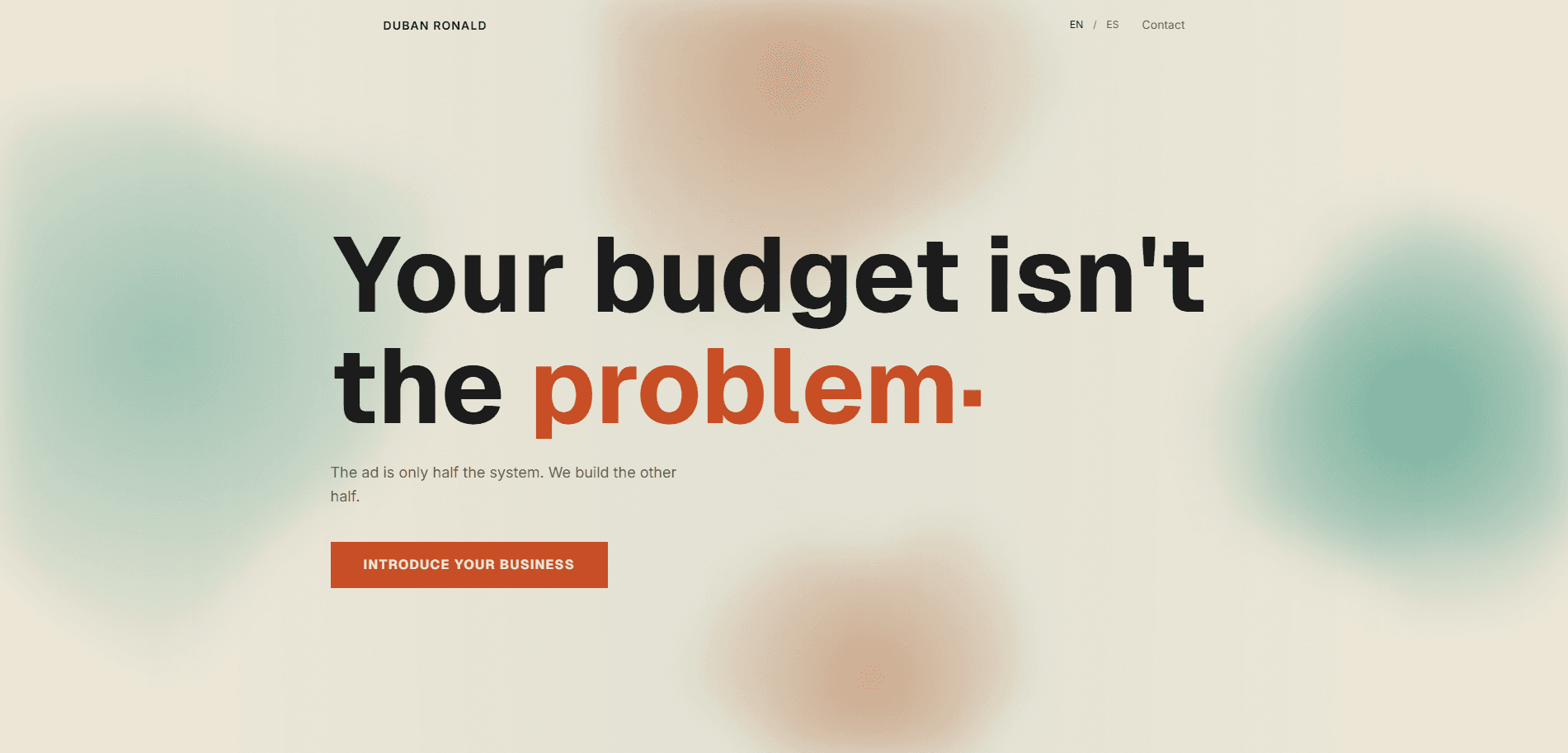
1Lead with the client's real objection
The page opens with the phrase he says most in first meetings. It filters visitors fast: people who nod keep reading, people who do not were never going to hire him.
2Editorial layout over agency gloss
Big type, short paragraphs, generous whitespace. It reads like a well set article, which matches how he sells: with arguments, not showreels.
Outcome
Shipped end to end and in use as his main link in outreach. The site does the qualifying before the first call.